In simple linear regression, we use the equation,
$$y = \beta_{0} + \beta_{1}x$$
In which \(\beta_{0}\) is a constant (\(x\) intercept) and \(\beta_{1}\) is the coefficient or the slope of \(x\)
We call this a linear equation as it will represent a straight line if we were to plot this in a bidimensional plain.
So if you were to plot \$\$math-plot ,
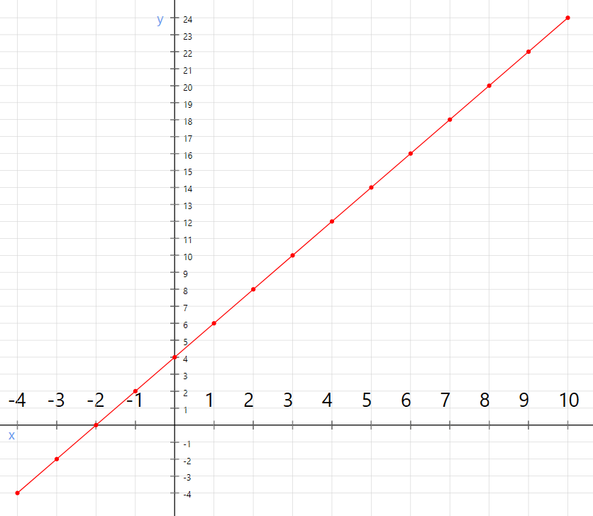
The y intercept, in this case, is 4 that is the point where the line intercepts the vertical axis y. so $$\beta_{0}$$ is 4. and the slope, in this case, is 2 which we can obtain using $$\Delta y / \Delta x$$
But the data in the real world on average follows a linear pattern and they are not gonna be always in line with our equation. so there will be errors. and what are the errors? an error is at a given point, the difference between real value and the value presented by the equation
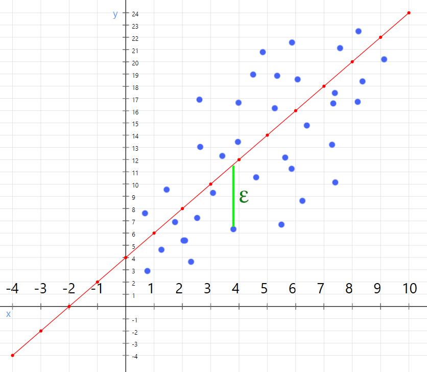
And what the regression algorithm going to do is minimize the errors and adjust the equation to create the line with the least possible errors.
So the linear regression model must include the error. After including the error, the model looks like this
$$y = \beta_0 + \beta_1 x + \varepsilon$$
Okay, now we have a basic idea about linear regression. let's go ahead and use it in R.
you can download the data set that I am going to use in this post from
Here .
Download the file as salaryData.csv to a folder and set it as the working directory in your R editor
This data set contains a Salary and TotalExperience variables which we can assume to have some correlation between them.
below is a visualization of the data set.
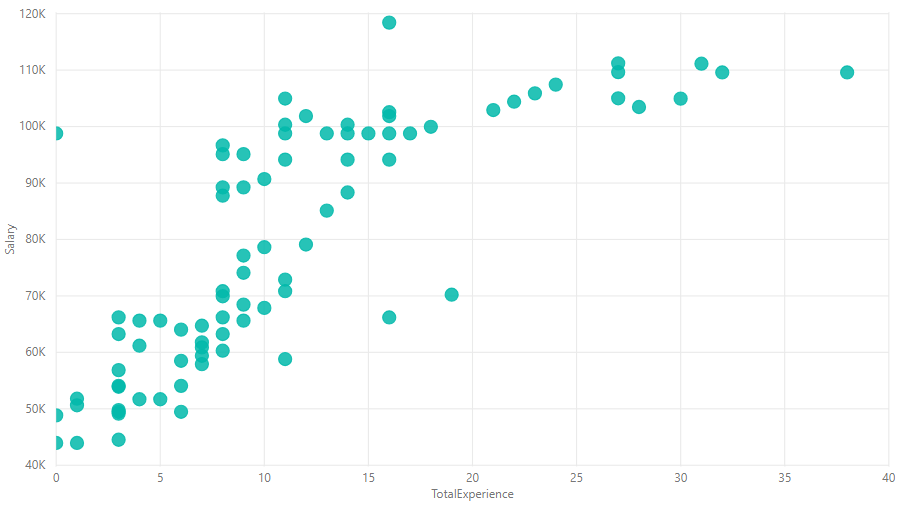
Next step is to determine the dependent variable and the independent variable. we can intuitively choose the salary as the dependent variable. so Salary will be the dependent variable and TotalExperience will be the independent variable.
Now let's load the data set and split the data set into two sets (training set and test set). we will choose .75 as the ratio as we have 100 records in the data set. this is generally considered as a good ratio.
data <- read.csv("salaryData.csv")
library(caTools)
set.seed(12345)
sp <- sample.split(data$Salary, SplitRatio = 0.75)
trainingSet <- subset(data, sp == TRUE)
testSet <- subset(data, sp == FALSE)
We won't need to apply feature scaling this time because the package that we are going to use will take care of the values with different scales.
Okay, now we are going to create the regressor that will perform the actual regression. we have to specify the variables that we want to use and the data set to the lm function which is in-built in R.
regressor <- lm(formula = Salary ~ TotalExperience, data = data)
And if you check the summary of regressor by typing summary(regressor) in console, you can see the actual coefficient that the model is going to use. and it also shows the statistical significance of the independent variable. the more significant the variable, the more impact it has to the final result.
Now we are ready to predict the values. let's go ahead and create a prediction vector for our test data set.
testPredictions <- predict(regressor, newdata = testSet)
If now you evaluate the testPredictions object, you will see all 25 predicted values for Salary variable are in this vector.
Now we are ready to see some plots. we will have to use another library to visualize our data. We are going to use the ggplot2 package for this. Install the package if you have not installed it already.
We are going to plot the line for both the test set and the training set. so let's write a function to do this.
library(ggplot2)
visualize <- function(experience, salary) {
ggplot() +
ggtitle('Experience vs Salary') +
xlab('Years of Experience') +
ylab('Salary') +
geom_point(aes(x = experience, y = salary), colour= 'red') +
geom_line(aes(x = trainingSet$TotalExperience, y = predict(regressor, newdata = trainingSet)), color='blue')
}
visualize(trainingSet$TotalExperience, trainingSet$Salary )
visualize(testSet$TotalExperience, testSet$Salary )
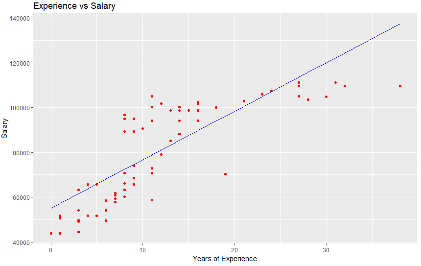
this results in below graphs
for training data
for test data
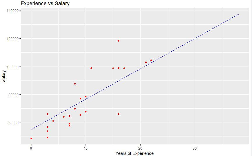
With these plots, you can see the model has adjusted the equation to create the most error-free line possible.
Below is the complete script that we build in this article.
data <- read.csv('salaryData.csv')
library(caTools)
set.seed(12345)
sp <- sample.split(data$Salary, SplitRatio = 0.75)
trainingSet <- subset(data, sp == TRUE)
testSet <- subset(data, sp == FALSE)
regressor <- lm(formula = Salary ~ TotalExperience, data = data)
testPredictions <- predict(regressor, newdata = testSet)
library(ggplot2)
visualize <- function(experience, salary) {
ggplot() +
ggtitle('Experience vs Salary') +
xlab('Years of Experience') +
ylab('Salary') +
geom_point(aes(x = experience, y = salary), colour= 'red') +
geom_line(aes(x = trainingSet$TotalExperience, y = predict(regressor, newdata = trainingSet)), color='blue')
}
visualize(trainingSet$TotalExperience, trainingSet$Salary )
visualize(testSet$TotalExperience, testSet$Salary )


